Invalid email format
This email is already subscribed
You have been succesfully subscribed to our newsletter
At the bottom of the eye (retina) there are millions of cells (papilitas) specialized in detecting different wavelengths coming from our environment. These wonderful cells, mainly the cones and rods (so called because of their shape), collect the different parts of the light spectrum solar energy and transform them into electrical impulses, which they are sent to the brain through the optic nerves. The brain is responsible for creating the sensation of color by assigning one color to each visible wavelength (coloration).
Canes and cones are indispensable mutually, because the human eye does not is able to perceive a color if the lighting it is not abundant because with little lighting registers the environment in "Black and white".
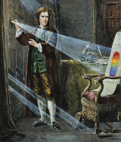
It was Isaac Newton (1641-1727) who had the first evidence (1666) that the color does not exist. Enclosed in one piece dark, Newton let a small beam of white light through a hole. He intercepted that light with a small crystal, a prism with a triangular base, and saw (perceived) that when passing through the glass the ray of light decomposed and appeared the six colors of the spectrum reflected on the wall where the ray of light struck original: red, orange, yellow, green, blue, indigo and violet.
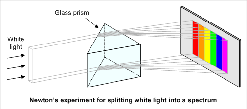
"Color does not exist and it is not characteristic of an object but a subjective appreciation"
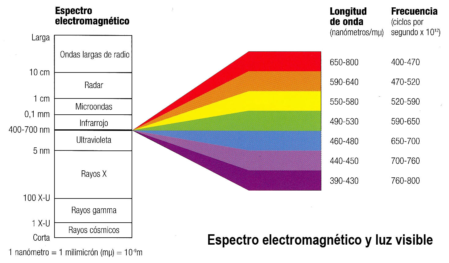
The color is therefore a fact of the vision that results of the differences of perceptions of the eye to different wavelengths that make up what it is called the "spectrum" of reflected white light on a sheet of paper. These visible waves are those whose wavelength is between 400 and 700 nanometers; beyond of these limits there are still radiations, but they are no longer perceived by our sight.
An important aspect of color theory to know the difference between light color (the one that comes from a source luminous colored) and the color pigment or material color (oil, tempera, colored pencils, etc.).
Additive colors are for example those of the foci of a scenario that is used to get an illumination of a concrete color. Also those who use the screens, looking with a magnifying glass at the screen of a computer or a TV you can see points of red, green and blue color (RGB or RGB in English). The sum of the three is the white, the absence of all the black (Darkness).
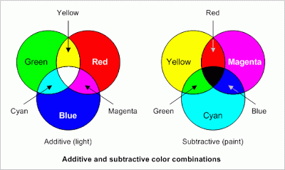
Subtractive colors are those used for example a painter of walls to mix the colors and are at that we will refer to in drawing. The sum of the three is black, the absence of all white (paper). They are also those used in a printing press. Looking with a magnifying glass a color magazine can be seen dots of cyan, magenta and yellow. I also know they see points of black color. The printers use the black in addition to the three primary colors because the letters are usually that color (CMAN or CMYK in English).
Light source
Color in Matter
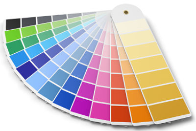
Primary colors The primary colors are those colors that are not can be obtained by mixing no other, so they are considered unique. Three are the colors that they fulfill these characteristics: yellow, magenta and cyan. For the study of plastic arts are fire red, blue ultramarine and yellow even though the latter is printed at moment of wanting to make a quality impression, it is only applied to the arts.
Model RGB = Color Light Blue + Green = Cyan Green + Red = Yellow Blue + Red = Magenta CMYK Model = Color Pigment Yellow + Cyan = Green Yellow + Magenta = Red Magenta + Cyan = Blue Model RYB = Color Pigment Yellow + Red = Orange Red + Blue = Violet Blue + Yellow = Green
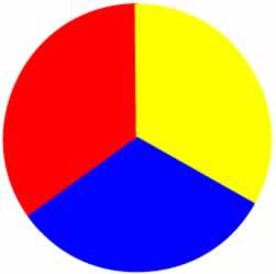
Secondary colours The primary colors are those colors that are not can be obtained by mixing no other, so they are considered unique. Three are the colors that they fulfill these characteristics: yellow, magenta and cyan. For the study of plastic arts are fire red, blue ultramarine and yellow even though the latter is printed at moment of wanting to make a quality impression, it is only applied to the arts. The secondary colors green, orange and violet or purple- they are the combination of two mixed primary colors in equal parts. This makes the secondary colors more complex and versatile than the primary ones. Colors side works well when used with each other or in combination with the primary ones. Because of its intensity, secondary colors are used frequently

Intermediate Colors Intermediate or tertiary colors are those obtained by joining a primary color with one secondary, for example, the color resulting from the mixture from yellow (primary color) to green (secondary color). The resulting color will be considered an intermediate color, and will be composed of yellow and green pigment in equal parts. In the denomination of these colors the two intervene colors used in its composition. First we will quote the primary color, and then the secondary color. By example: Yellow-green, Red-orange ...
The Munsell tree
Munsell created a "tree" in which the colors were distributed by branches in order of saturation or purity. And where
the branches can be of different length, for example, the branch of yellow is very long, and that of the orange,
much shorter.
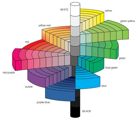
In a vertical direction, the tree is segmented ten intervals that go from 0 (pure black, below) to 10 (pure white, top). The branches divide into segments, from zero in the center for neutral colors (gray) up to 20 or more. As the scale has no limits, even the Fluorescent materials find their place.
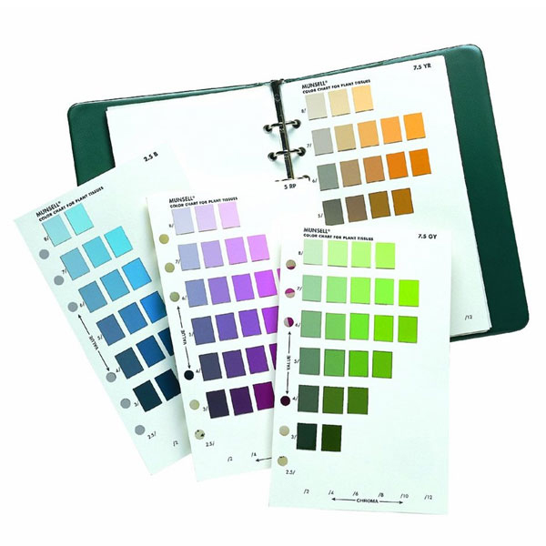
The colors of Munsell are specified using the notation HV / C, where H is hue or hue, V is the value and C is the chroma or the saturation. To facilitate the reading of the specifications, the color number is accompanied by the initial (s) of the adjacent primary. So a intense red would be 5R 5/16. The notation varies for neutrals: the color is N and saturation is omitted, so a black ink would be N1 /.
The Munsell tree has proven its effectiveness in the fields of manufacturing, art, illustration and design, and based on Many industrial specification systems chromatic standard. Its main drawback is that the selection of colors realities of the tree obeys both subjectivity of Munsell as to his scientific method.
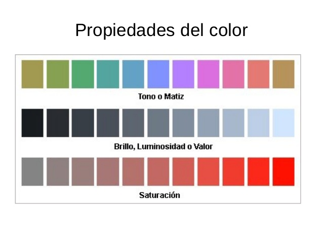
The properties of color are basically elements different that make a certain color unique, they make you vary their appearance and define their final appearance. They are based on one of the most accepted color models currently, made by Albert Münsell in 1905.
Hue
The properties of color are basically elements
different that make a certain color unique, they make you
vary their appearance and define their final appearance. They are
based on one of the most accepted color models
currently, made by Albert Münsell in 1905.
It is the quality by which we differentiate and give
name the color. It is pure state, without white or black
aggregates, and it is an attribute associated with the length of
dominant wave in the mix of light waves. Is
the sum of wavelengths that can reflect a
surface1.
The nuance allows us to distinguish red from blue, and refers
to the path that makes a tone towards one or the other side of the
chromatic circle, so the yellowish green and the green
bluish will be different shades of green.
Value or luminosity
It is a term used to describe how clear or how
Dark looks like a color and refers to the amount of light perceived.
Regardless of the values of the
colors, because these can be altered by the addition
of white that takes the color to keys or luminosity values
higher, or black that diminishes them.
Colors that have a high value (light), reflect more
light and those of low value (dark) absorb more light. Inside
of the chromatic circle, yellow is the color of greatest
luminosity (closer to white) and violet the
minor (closer to black).
Saturation or brightness
This concept represents the vividness or pallor of a color,
its intensity, and can be related to the bandwidth
of the light that we are visualizing. The pure colors of
spectrum are completely saturated. An intense color
It is very alive, when the color is saturated the more it is
the impression that the object is moving.
This property differentiates an intense color from a pale one.
Saturation can be conceived as if it were brilliance
of one color. This can also be defined by the amount
of gray that contains a color: the more gray or more
neutral is, less bright or less saturated is, and so
So, less alive. Any change made to a color
pure, it automatically lowers its saturation. Each one of
the primary colors has its highest intensity value
before being mixed with others.
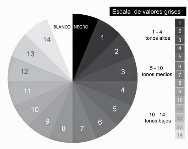
When we mention the term achromatic we are talking about the gray levels that exist between white and black. On the scale we can talk about 9 levels that will start with the target and end in the black. In the first three levels we will find the scale of highest value and in the next three we will talk about of the intermediate or medium-value scale, the last three will be those that belong to the scale of lower value When we need to make a black and white drawing, can cause the effects of light and shadow, it is necessary perform an assessment using the achromatic scale of so that the contrasts of light and shade are the persecuted, so it is evident that we will have to use the gray scale.
Transfer of tones.
Gray tone transfer.
Achromatic wheel.
When we use or talk about the monochromatic scale we are referring to a single color, and the variations will occur due to the levels of assessment and saturation. The monochromatic scale of a color, for example blue, is refers to all the different nuances we can find inside this color. The different shades are achieved combining color with white in different degrees. When we make a design, it will have a larger chromatic unit. if we use a monochromatic scale to assess it.
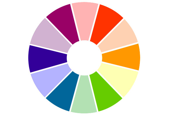
The color circle - also called the circle of shades, chromatic wheel or color wheel - is the result of distribute around a circle, the different colors that make up the visible light segment of the spectrum solar, discovered by Newton, and maintaining order correlative: red, orange, yellow, green, ultramarine blue and Violet. Specification of Chromatic Circle The most common chromatic circle - the one used by pictorial artists - is based on red, yellow and blue, imperfect subtractive system that professionals who work with paint, fabrics or others usually adopt reflective materials. The primary colors of the wheel are also combined with the secondary colors, each one of which represents a combination of adjacent primaries. Six tertiaries are also included, with which you get a total of 12 colors. The process wheel - based on the CMYK model, from Graphic printing - shows cyan ink blends, magenta and yellow Unlike other subtractive wheels, it shows a full spectrum of colors, including red, green, and blue (RGB) as secondary relatively pure.
Chromatic wheel of the pigtoricos artists Ultramarine Blue - Fire Red - Yellow.
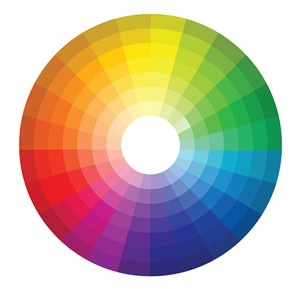
A color wheel basically orders a form sequential the progression of the colors that form the visible spectrum, from red to violet. In color, harmonizing means coordinating the different values that the color acquires in a composition, is say, when in a composition all the colors they have a part common to the rest of the component colors. The harmonic are the combinations in which use modulations of the same hue, or also of different nuances, but that maintain a certain relationship with the chosen colors.
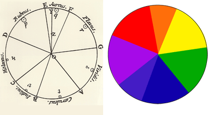
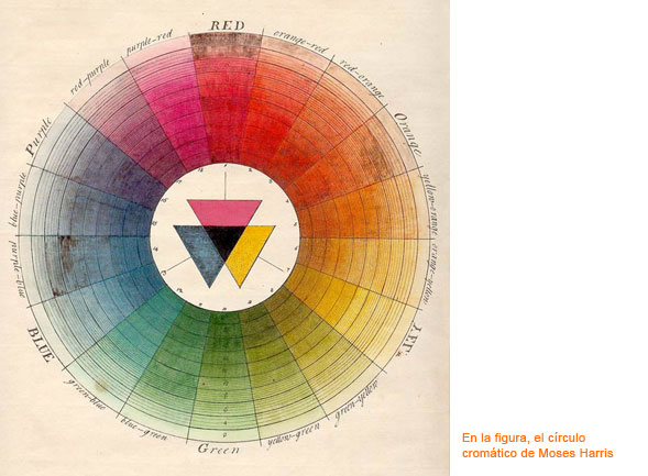
The chromatic circle that we know has had many variants and various theorists have elaborated their proposals. The purpose of the color wheel, Newton ring or circle of shades is to show all the colors of the spectrum with their transitions, even the Bauhaus put their geniuses to work on their own theories and measurements, such as the color star and others Chromatic "circles" developed by teachers.
In the origins of the chromatic systems the problem was the order in which to establish the colors, to organize them with respect to others and to obtain a classification, since in addition the denomination for each color could vary a lot and was far from being exact as for its nomenclature, whether red vermilion or crimson, contains different "sociocultural" nuances. Because of these cultural and environmental facts in the denomination of colors there are important variations in their perception and classification, an Eskimo sees many more shades of white than a European, as it has more specific names of white to an African who perceives more nuances of the red for example and in their culture there are more specific names for red. Another aspect is the origin, for example the ultramarine blue, since it was a color in which its material to mix with a binder came from overseas hence its name. Among the first that began to realize their theories with their classification modes are the Runge sphere, the ostwald solid, the munsell solid, the NCS system or the three coordinate systems (H, S, L). All of them have laid the foundations of what was the beginning of the sphere of color and its various methods of measurement.
Before starting a small explanation of the perception of colors. These are perceived because there is light, without the light the colors would not be seen. This interaction of light with matter allows us to appreciate the different shades and colors of the material, because light stimulates the specific cells to collect the information of color in our eyes (cones, optic nerve ...) and we visualize it. Basically when a ray of light touches an object certain radiation of a wavelength are absorbed and others reflected and what we receive is the mixture of those radiations reflected in a diffuse way. When the sunlight touches the object it absorbs some frequencies and other reflects them, which added to the eye gives us the sensation of the color of the reflected waves. In the issue of wavelength frequencies that the human being is able to perceive in color is a small range of color spectrum that I have already explained with the white balance ranging from 380 to 400 nm. Also, keep in mind that the eye is responsible for making the mixes of those wavelengths that reach us.
Once explained a couple of basic concepts, to interact with the color wheel must take into account the color harmonies. When correcting color or interacting with color corrections it is very helpful to take into account these harmonies, both to correct and to look for a possible look. The primary colors, either additive (RGB) or subtractive (CMY) interact with each other depending on their purpose, but there are also harmonies and color chords as the proportions of Schopenhauer balance.
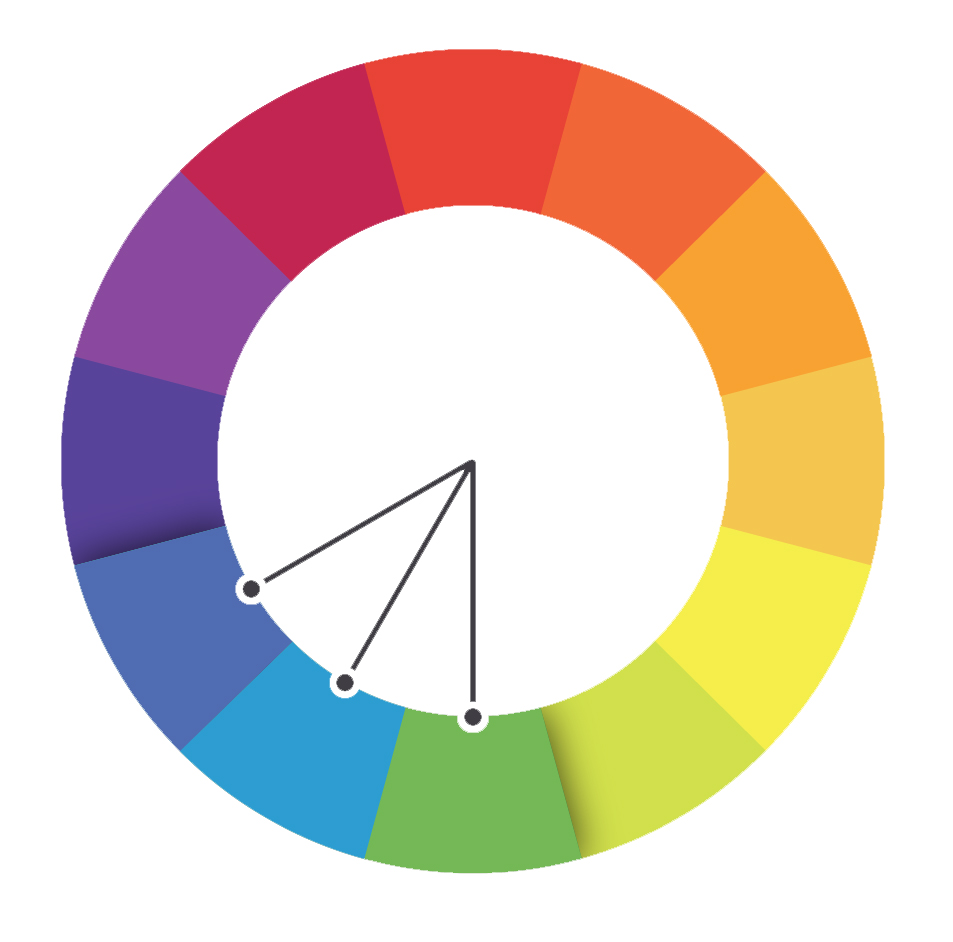
The analogous colors are next in the color wheel. The chosen color and its two colors next to both sides, are the colors that predominate in nature and always work well.
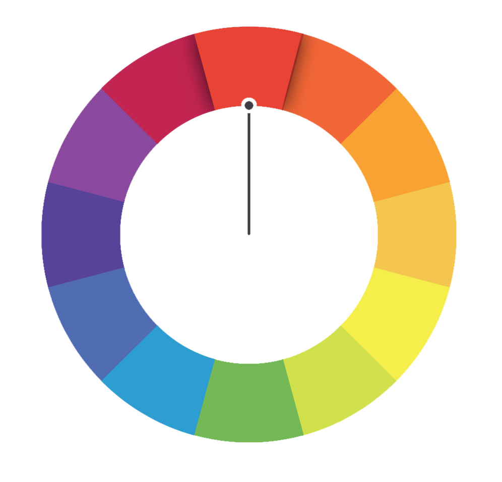
The monochromatic colors are those that have the same dye, but differ in hue, value and saturation. For example, paint samples have several different values of the same color. Using two or more monochromatic colors will achieve an elegant and pleasant effect. Example: all range of brown or green, etc. Monochromatic colors were used pigments based on carbon, carbon black, gunpowder, Indian ink, were bluish black. In the polychromatic colors pigments of varied colors obtained from plants and minerals were used. Example: green-gold, gray-lead, pewter, etc.
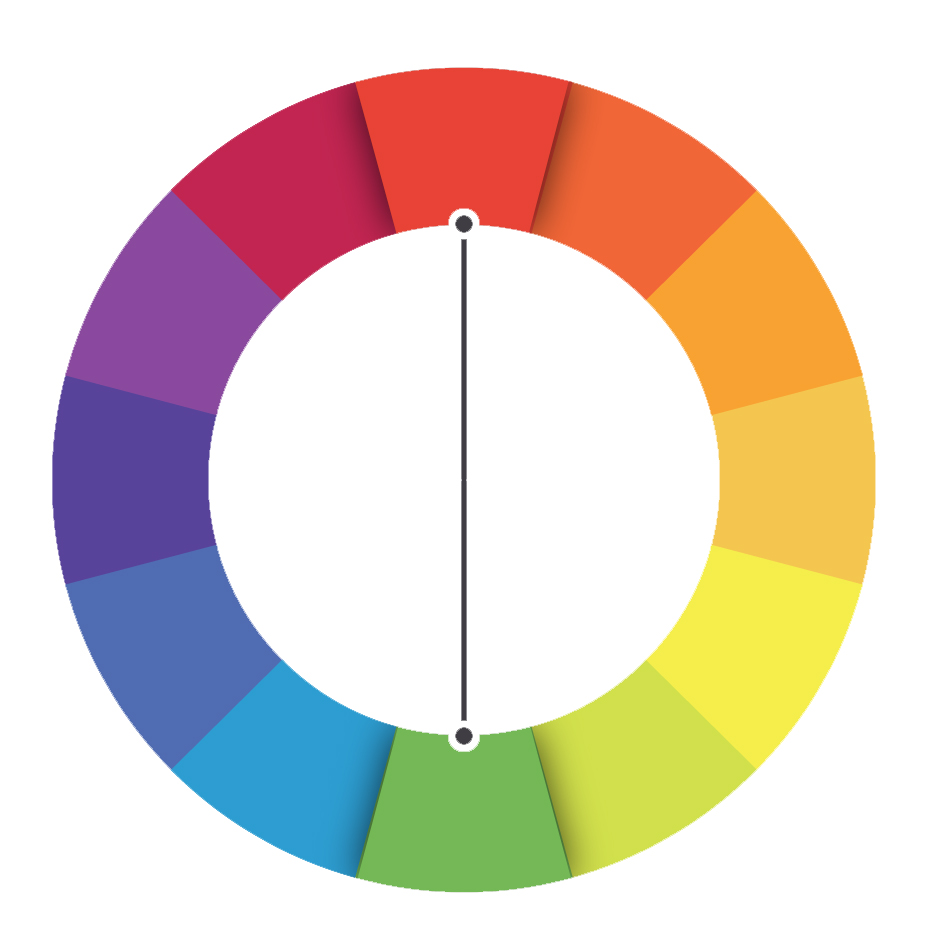
The complementary or contrast. The complementary is responsible for neutralizing its opponent if you want to balance a clip. Some 180º in a straight line is always the color that neutralizes that unwanted color. There are more or less saturated colors that need more of their counterpart in certain shades, this would be basic, although as a general rule you have to use it in the same amount. It does not exist in color to subtract color or remove a color, its complementary is added to neutralize that color. In the balanced color is the way to act. When working with looks and touch the shadows and lights another way of working is based on the complementary / opposite. The shadows in a tone and the lights in their complementary. They give a lot of strength to the image as the colors reinforce each other. The typical American "Blockbuster" look with a cyan or bluish tone in the shadows and with orange / red tones in the lights. Some predefined looks of Magic Bullet are based on these harmonies of color to interact based on complementary shadows to the lights that give such a good result.
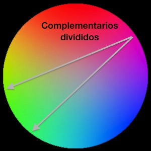
Complementaries divided instead of choosing complementary colors or double contraries choose the two adjacent colors of the chosen color, do not completely cancel the opposite color, you leave a predominant tone.
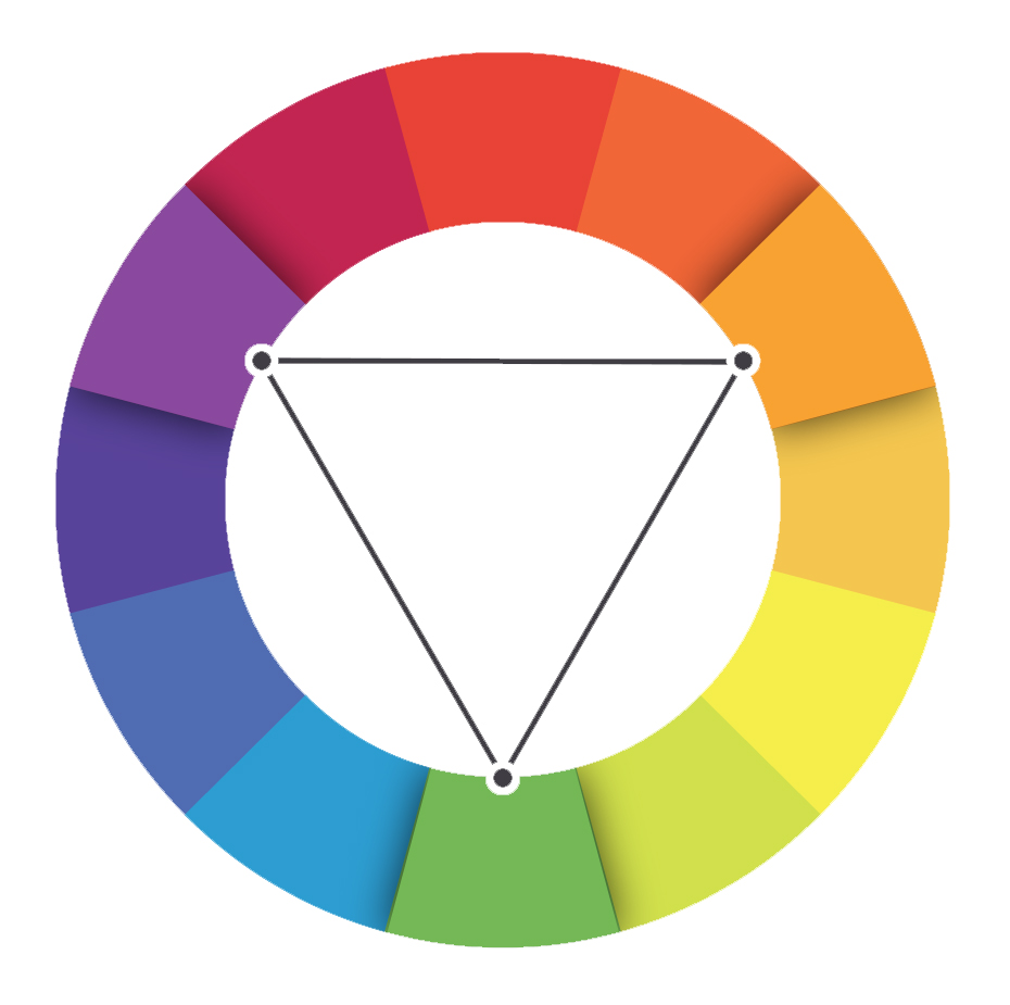
The next thing we have are the triads. They are color harmonies that work with 120º angles in the chromatic circle to join 3 colors, they are stable and complementary colors. The harmony would originate form the yellow, red and blue, the basic. They are the colors of summer in its fullness, the yellow of the sun or fields of wheat, the red of heat, poppies and sunsets and the blue of the sky. You choose the same saturation for the three tones that join those three lines separated by an angle of 120º, they are colors that work wonderfully to work the environment of the landscapes and seasons, turning the triad in the sense of the clockwise we can work more faithfully a sunset. The second triad is formed by the colors orange, violet and green. Goethe called them secondary.
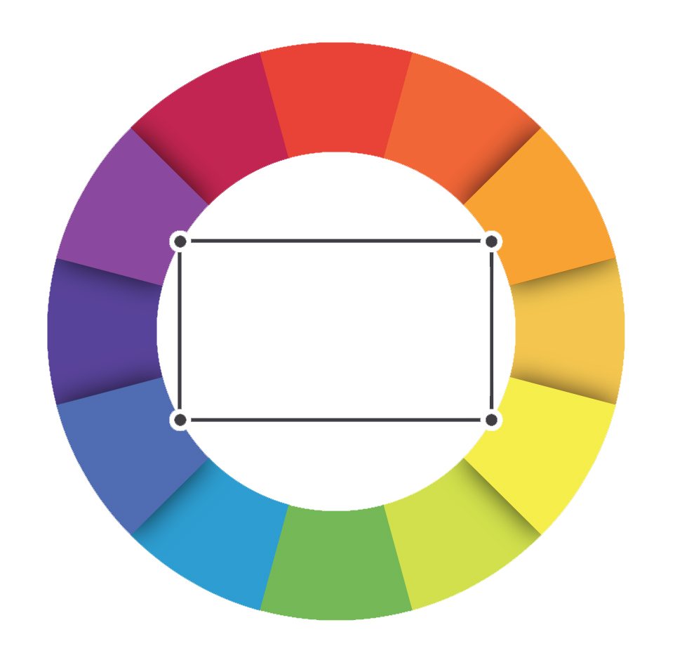
The tetrads are combinations of chords of four colors, not to be confused with using two complementary pairs (here an angle of 90º) is more complicated to work with them in color correction. There are harmonies of six colors in which, in addition to the 4 colors, chromatic chiaroscuro enters, there are buildings constructed with these patterns.
A small introduction to the color wheel and another way of focusing work with colors. I hope you like it. For the next correction with curves. I leave a small bibliography in which to delve into the subject, all highly recommended for color correction in both photo and video and the treatment of the image.