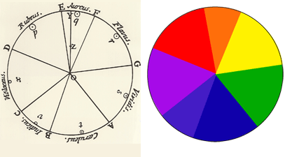
The chromatic circle that we know has had many variants and various theorists have elaborated their proposals. The purpose of the color wheel, Newton ring or circle of shades is to show all the colors of the spectrum with their transitions, even the Bauhaus put their geniuses to work on their own theories and measurements, such as the color star and others Chromatic "circles" developed by teachers.
In the origins of the chromatic systems the problem was the order in which to establish the colors, to organize them with respect to others and to obtain a classification, since in addition the denomination for each color could vary a lot and was far from being exact as for its nomenclature, whether red vermilion or crimson, contains different "sociocultural" nuances. Because of these cultural and environmental facts in the denomination of colors there are important variations in their perception and classification, an Eskimo sees many more shades of white than a European, as it has more specific names of white to an African who perceives more nuances of the red for example and in their culture there are more specific names for red. Another aspect is the origin, for example the ultramarine blue, since it was a color in which its material to mix with a binder came from overseas hence its name. Among the first that began to realize their theories with their classification modes are the Runge sphere, the ostwald solid, the munsell solid, the NCS system or the three coordinate systems (H, S, L). All of them have laid the foundations of what was the beginning of the sphere of color and its various methods of measurement.
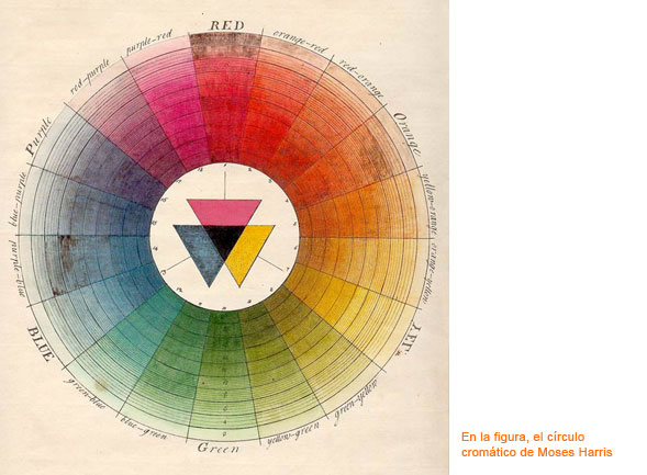
Before starting a small explanation of the perception of colors. These are perceived because there is light, without the light the colors would not be seen. This interaction of light with matter allows us to appreciate the different shades and colors of the material, because light stimulates the specific cells to collect the information of color in our eyes (cones, optic nerve ...) and we visualize it. Basically when a ray of light touches an object certain radiation of a wavelength are absorbed and others reflected and what we receive is the mixture of those radiations reflected in a diffuse way. When the sunlight touches the object it absorbs some frequencies and other reflects them, which added to the eye gives us the sensation of the color of the reflected waves. In the issue of wavelength frequencies that the human being is able to perceive in color is a small range of color spectrum that I have already explained with the white balance ranging from 380 to 400 nm. Also, keep in mind that the eye is responsible for making the mixes of those wavelengths that reach us.
Once explained a couple of basic concepts, to interact with the color wheel must take into account the color harmonies. When correcting color or interacting with color corrections it is very helpful to take into account these harmonies, both to correct and to look for a possible look. The primary colors, either additive (RGB) or subtractive (CMY) interact with each other depending on their purpose, but there are also harmonies and color chords as the proportions of Schopenhauer balance.
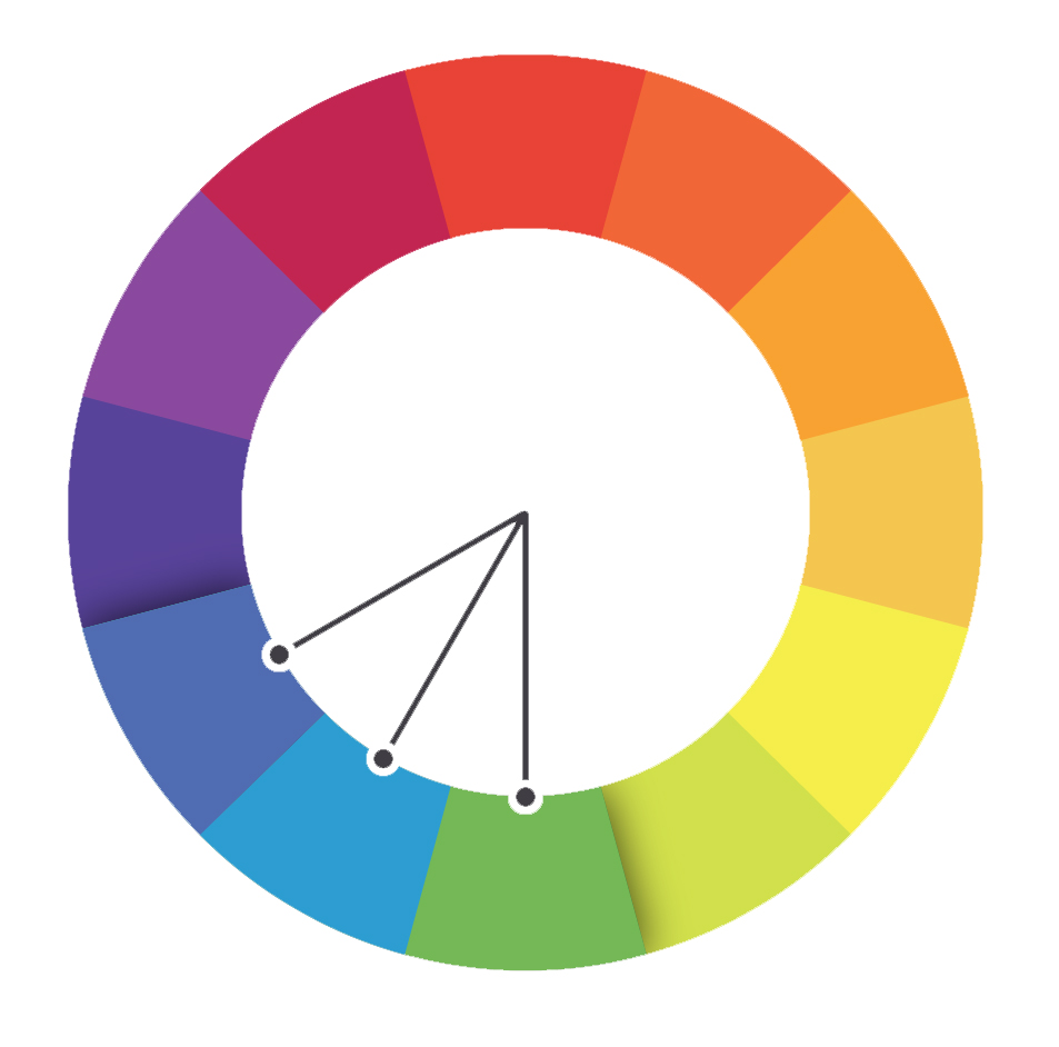
The analogous colors are next in the color wheel. The chosen color and its two colors next to both sides, are the colors that predominate in nature and always work well.
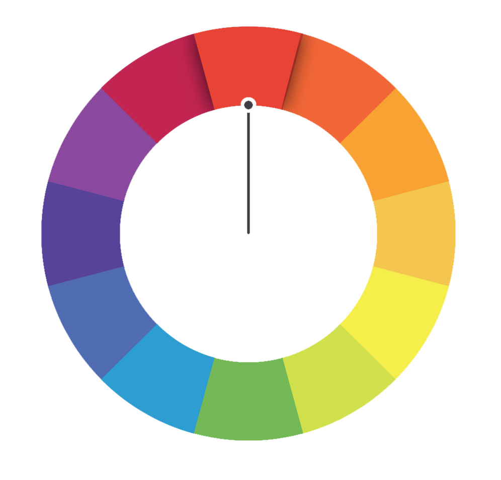
The monochromatic colors are those that have the same dye, but differ in hue, value and saturation. For example, paint samples have several different values of the same color. Using two or more monochromatic colors will achieve an elegant and pleasant effect. Example: all range of brown or green, etc. Monochromatic colors were used pigments based on carbon, carbon black, gunpowder, Indian ink, were bluish black. In the polychromatic colors pigments of varied colors obtained from plants and minerals were used. Example: green-gold, gray-lead, pewter, etc.
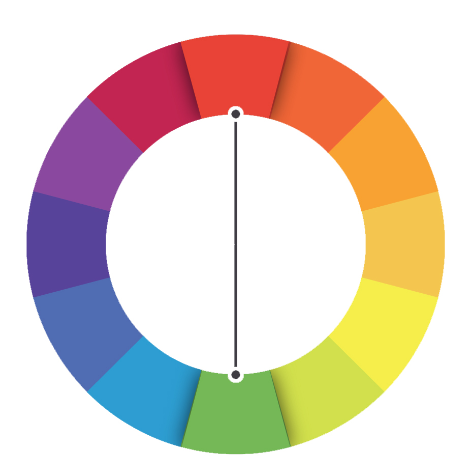
The complementary or contrast. The complementary is responsible for neutralizing its opponent if you want to balance a clip. Some 180º in a straight line is always the color that neutralizes that unwanted color. There are more or less saturated colors that need more of their counterpart in certain shades, this would be basic, although as a general rule you have to use it in the same amount. It does not exist in color to subtract color or remove a color, its complementary is added to neutralize that color. In the balanced color is the way to act. When working with looks and touch the shadows and lights another way of working is based on the complementary / opposite. The shadows in a tone and the lights in their complementary. They give a lot of strength to the image as the colors reinforce each other. The typical American "Blockbuster" look with a cyan or bluish tone in the shadows and with orange / red tones in the lights. Some predefined looks of Magic Bullet are based on these harmonies of color to interact based on complementary shadows to the lights that give such a good result.
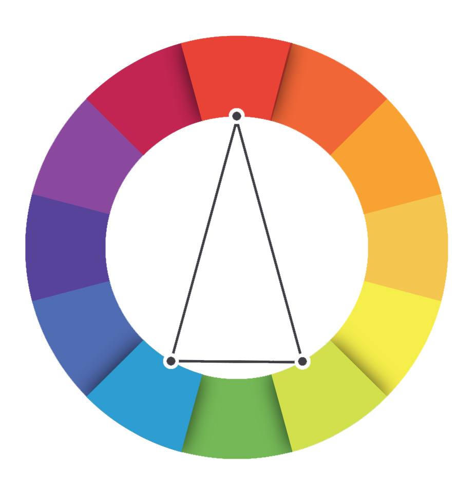
Complementaries divided instead of choosing complementary colors or double contraries choose the two adjacent colors of the chosen color, do not completely cancel the opposite color, you leave a predominant tone.
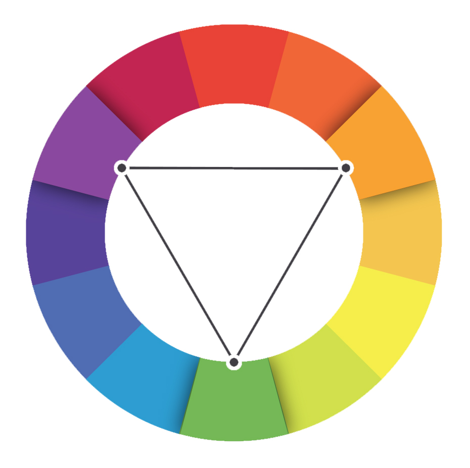
The next thing we have are the triads. They are color harmonies that work with 120º angles in the chromatic circle to join 3 colors, they are stable and complementary colors. The harmony would originate form the yellow, red and blue, the basic. They are the colors of summer in its fullness, the yellow of the sun or fields of wheat, the red of heat, poppies and sunsets and the blue of the sky. You choose the same saturation for the three tones that join those three lines separated by an angle of 120º, they are colors that work wonderfully to work the environment of the landscapes and seasons, turning the triad in the sense of the clockwise we can work more faithfully a sunset. The second triad is formed by the colors orange, violet and green. Goethe called them secondary.
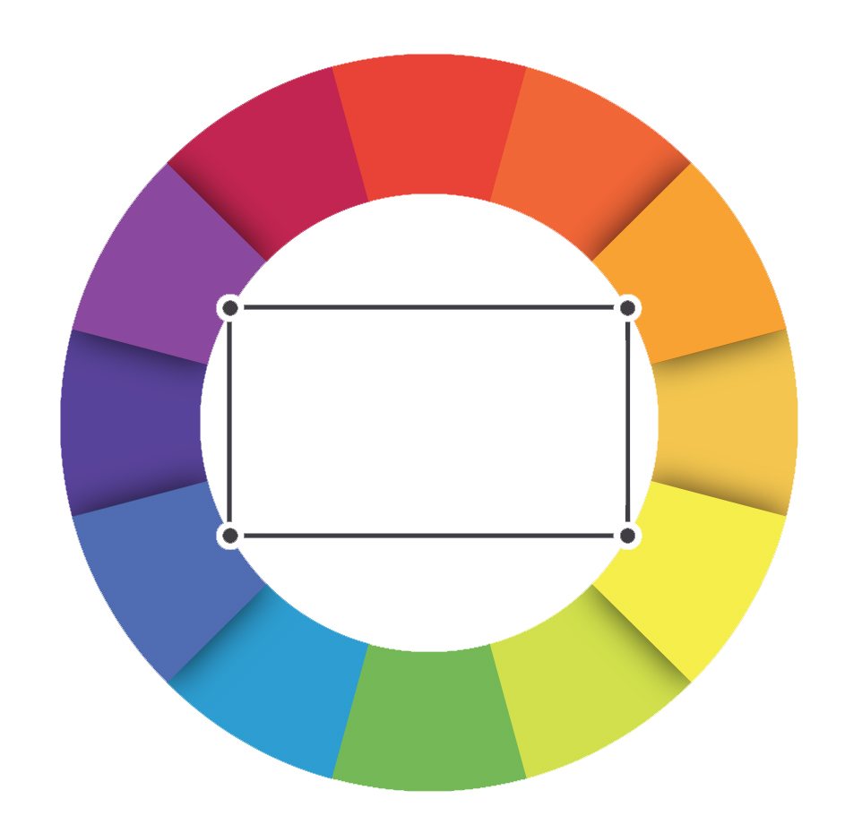
The tetrads are combinations of chords of four colors, not to be confused with using two complementary pairs (here an angle of 90º) is more complicated to work with them in color correction. There are harmonies of six colors in which, in addition to the 4 colors, chromatic chiaroscuro enters, there are buildings constructed with these patterns.
A small introduction to the color wheel and another way of focusing work with colors. I hope you like it. For the next correction with curves. I leave a small bibliography in which to delve into the subject, all highly recommended for color correction in both photo and video and the treatment of the image.
